BP
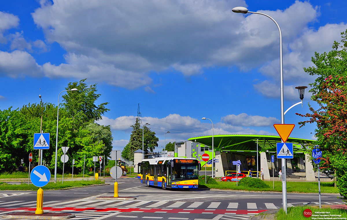
Плоцк, Solaris Urbino IV 12 hybrid № 756
  ПлоцкSolaris Urbino IV 12 hybrid № 756  —  маршрут 10, Winiary, szpital Trasa Zmieniona
Ulica Chopina / Ulica Mickiewicza

Автор: Aleksander2560 · Варшава           Дата: 29 мая 2019 г., среда

Статистика

Опубликовано 16.08.2020 18:15 EEST
Просмотров — 225


Подробная информация

Плоцк, Solaris Urbino IV 12 hybrid № 756

Предприятие:Komunikacja Miejska - Płock sp. z o.o.
Госномер:WP 4756L
С...:2018
Модель:Solaris Urbino IV 12 hybrid
Построен:2018
Заводской №:19452
VIN:SUU241163JB019452
Текущее состояние:Эксплуатируется
Назначение:Линейный

Комментарии · 7

18.08.2020 19:53 EEST
Ссылка
German Perfectionist · Мюнхен
Фото: 4868 · Общий редактор / Редактор городов и моделей
Nice photo in general, but very oversaturated... Looks unrealistic and unprofessional.
Ruined by the editing.
0
+0 / –0
18.08.2020 20:14 EEST
Ссылка
CitaroMH · Мюльхайм-на-Руре
Фото: 4 · Общий редактор / Редактор городов и моделей
The trees in the background on the left are a bit oversatured., but nice photo btw.
0
+0 / –0
18.08.2020 21:00 EEST
Ссылка
Aleksander2560 · Варшава
Фото: 1211 · Общий редактор
Yes, yes... you're right always and everywhere... especially, when you added "the best" pictures where we can see only a bus and nothing else. If You have a problems, maybe you should change a photogallery...
0
+0 / –0
18.08.2020 22:29 EEST
Ссылка
IKS · Минск
Фото: 11452
This is a good photo, no doubt about it.
0
+0 / –0
18.08.2020 23:27 EEST
Ссылка
German Perfectionist · Мюнхен
Фото: 4868 · Общий редактор / Редактор городов и моделей
Quote (Aleksander2560, 18.08.2020):
> especially, when you added "the best" pictures where we can see only a bus and nothing else.

You just can't take criticism mate. I've seen this in a few of your other pictures, people commenting that the saturation is way too intense and you just insulting them or their pictures. It's not like you're right "always and everywhere" either...


Quote (IKS, 18.08.2020):
> This is a good photo, no doubt about it.

It's completely oversaturated, no doubt about it. The trees, the station, the sky, the signs, everything is just way too colourful and looks artificial. That doesn't make for good photos. A good photo is an accurate representation of the reality. The photo itself is nice, the editing isn't.
0
+0 / –0
19.08.2020 11:41 EEST
Ссылка
Aleksander2560 · Варшава
Фото: 1211 · Общий редактор
Cytat (German Perfectionist, 18.08.2020):
> You just can't take criticism mate. I've seen this in a few of your other pictures, people commenting that the saturation is way too intense and you just insulting them or their pictures. It's not like you're right "always and everywhere" either...

I can put up with criticism ... and here you are clearly picking on. Yes, 90% of my photos get that opinion, of course. Second thing, I don't offend anyone. You used the word "unprofessional" yourself, and that is a cheek to me, especially when looking at your photographic work here on busphoto.eu. So much for me, it doesn't make sense to continue the discussion. Have a nice day.
0
+0 / –0
19.08.2020 12:21 EEST
Ссылка
IKS · Минск
Фото: 11452
Each of us has controversial photos, but I think starting a discussion under such a photo is definitely not right.
0
+0 / –0

Ваш комментарий

За обсуждение политики будет выноситься бан на 1 месяц.
Вы не вошли на сайт.
Комментарии могут оставлять только зарегистрированные пользователи.